Freelance Graphic Designer & Illustrator
The Studio
Graphic Designer Intern
House of Amalou
Graphic Designer Internship
Stockholm OP (Part:)
Studentcoach
There is a gap in how information and data are conveyed today. Many are interested in new research but the findings are not sufficiently accessible to those who do not have advanced knowledge in the field. This is my degree project where I wanted to explore new methods to simplify and visualise information that makes it easier to read and to comprehend.
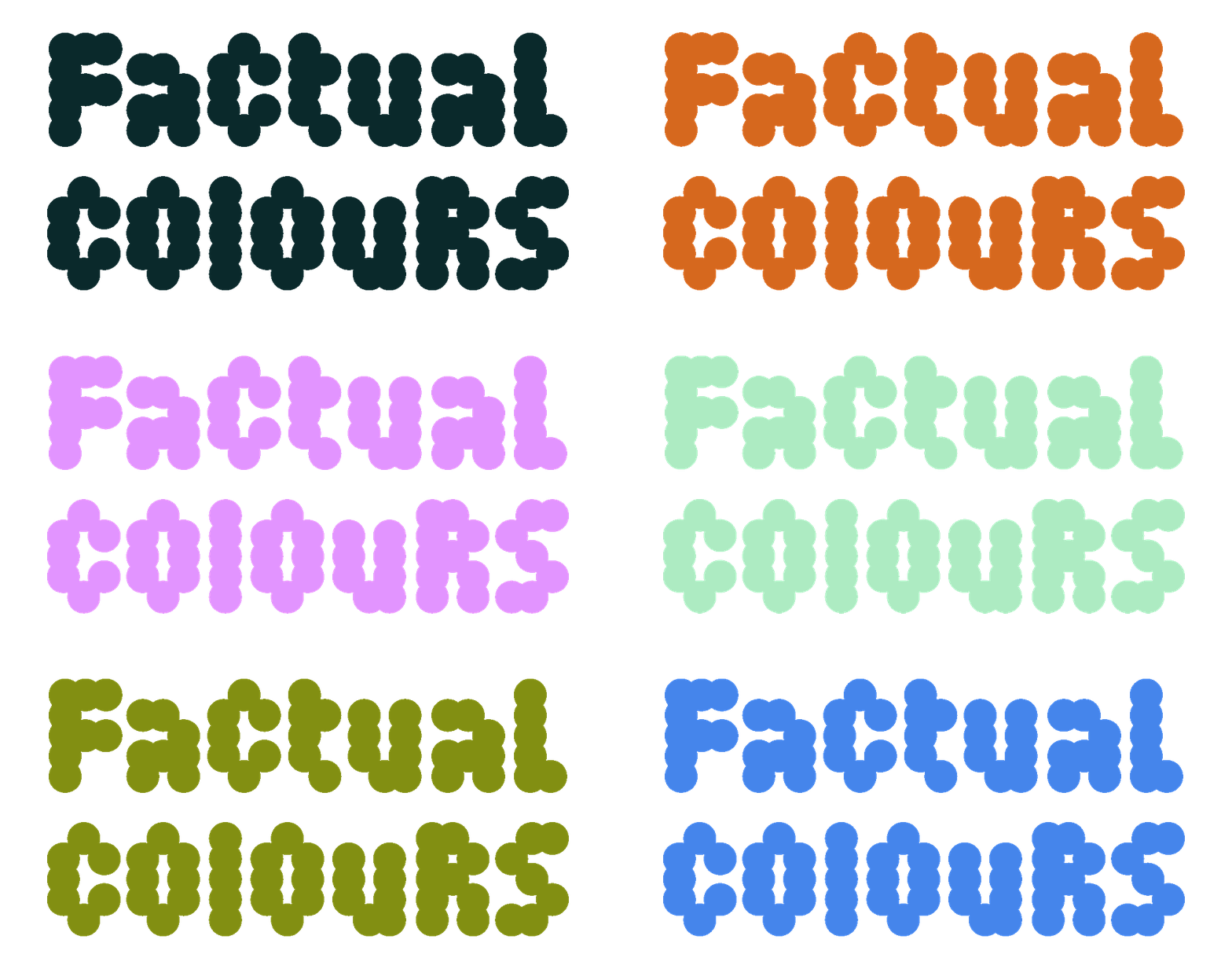
The purpose of this project is to create reflection on how graphic design can make something more tangible and how colour can be a way to convey knowledge in a clear way.
Through a colour scheme and animated infographics, I have created an introduction to new research on how we humans affect the Earth’s water cycle and what the consequences are for the Earth’s system, climate and all living things. The viewer is invited to interact with a set of colours that individually represents a different stage of water through the water cycle. A summary of problems, causes and brief facts related to each colour is presented, with an aim to provide an increased understanding, and create interest in the subject.
Visit the website on factualcolours.com
Music by: Elias Wirtén


Hello! ☀ I’m Sara Solén, a swedish graphic designer and art director, working within the fields of visual communication. I do everything from branding and creating visual identities, to graphic design (printed and digital matter), motion design, illustration and concepts. I have a special passion for typography and exploring with colours and shapes in different ways, both in print and in web.
hello@sarasolen.se
@sara.solen
LinkedIn
Freelance Graphic Designer & Illustrator
The Studio
Graphic Designer Intern
House of Amalou
Graphic Designer Internship
Stockholm OP (Part:)
Studentcoach
Beckmans College of Design
Bachelor of Fine Arts in Visual Communications
Södertörn University
Media Technology A&B
Berghs School of Communication
Distance course, Illustration
Konstfack
Orientation within Visual Communication and Culture
Stockholm University
Art History – Visual Studies I
Nyckelviksskolan
Graphic Design & Illustration
Adobe After Effects, Adobe InDesign, Adobe Illustrator, Adobe Photoshop, Adobe XD, Figma, HTML5/CSS, PHP, Basic JavaScript, Wordpress, Blender
Tekniska Museet 2019
Scenkonstmuseet 2020
Svenskt Tenn 2021 – "Food for Thought"
Judiska Museet 2021 – "Points of View"